Multi Destination Homepage
We introduced a mobile-friendly navigation which led to more purposeful clicks on mobile devices and ultimately decreased bounce rate and improved conversion.
Background
Brooklinen is a DTC brand “disrupting the bedding industry with premium, hotel-quality sheets and towels at accessible prices”.
Impact
0.03% ↓ Bounce Rate
6% ↑ Conversion
4% ↑ 2nd Page After
Homepage Click Through Rate
Role
Product Designer
Researcher
View On Brooklinen (Mobile Only)
Problem Statement
Brooklinen’s current homepage design limits the visibility of new and “icon” products by allowing only a single link above the fold, potentially negatively impacting prospect conversion.
Hypothesis &
How Might We
Surfacing more categories (rather than subcategories) above the fold will make it easier for users, specifically prospects first visiting the site, to easily identify and discover product to potentially purchase.
”How might we provide users with multiple top of fold entry points in a way that does not overwhelm them to decrease bounce rate?”
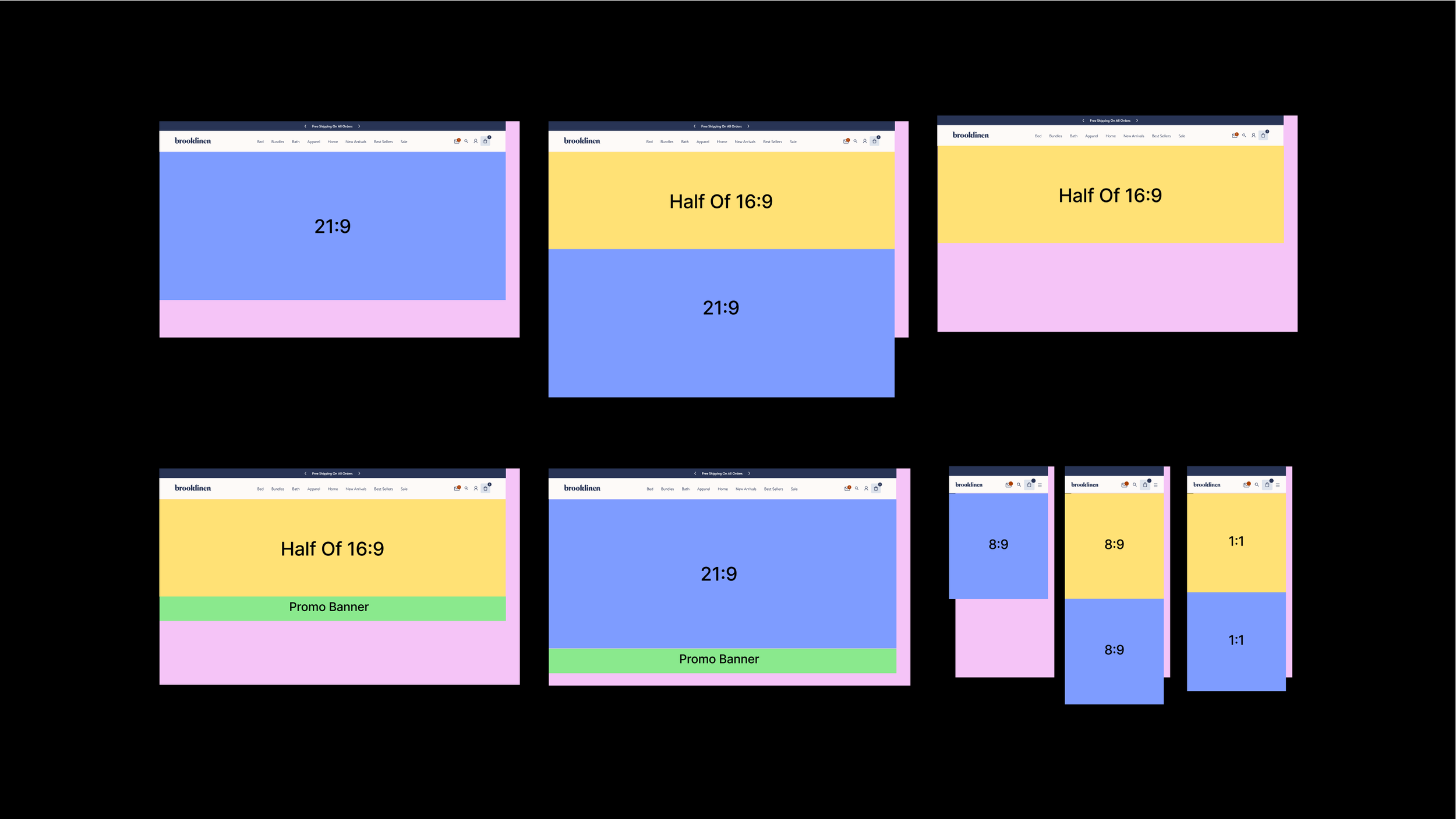
Exploration
To kick this initiative off I explored a broad range of solutions to support surfacing our new and icon products above the fold including:
Multi CTA Single Hero
Multi CTA Carousel Hero
Diptych Hero
Category Module Paired w/ Hero
Linking Strategy
After exploration I partnered with our site operations team to align on the linking strategy for the top of the fold on the homepage. We vetted our options with new hypotheses.
Hypotheses
Leveraging more than one destination above the fold will not only increase homepage CTR but also direct our users to relevant destinations during all sales periods.
Leveraging hidden destinations above the fold in a carousel might have diminishing returns decreasing with each additional slide.
Leveraging more than two destinations above the fold could create decision fatigue if the creative asset strategy is not clear.
Adding category links above the fold will drive users to relevant destinations.
Sending prospect users to our bestsellers page will improve conversion by simplifying decision making for those who are unsure where to start.
Competitive Analysis
In addition to the exploration I completed 5 unmoderated user interviews with the goal to benchmark Brooklinen’s strengths and weaknesses with key competitors. This additionally validated our earlier hypothesis of surfacing product categories above the fold as we saw this was a market trend amongst direct competitors.
From this work we deduced, providing multiple entry points near the top of the fold can be effective, with visually driven options attracting more engagement than traditional navigation elements and formed our recommendation from there.
Recomendation
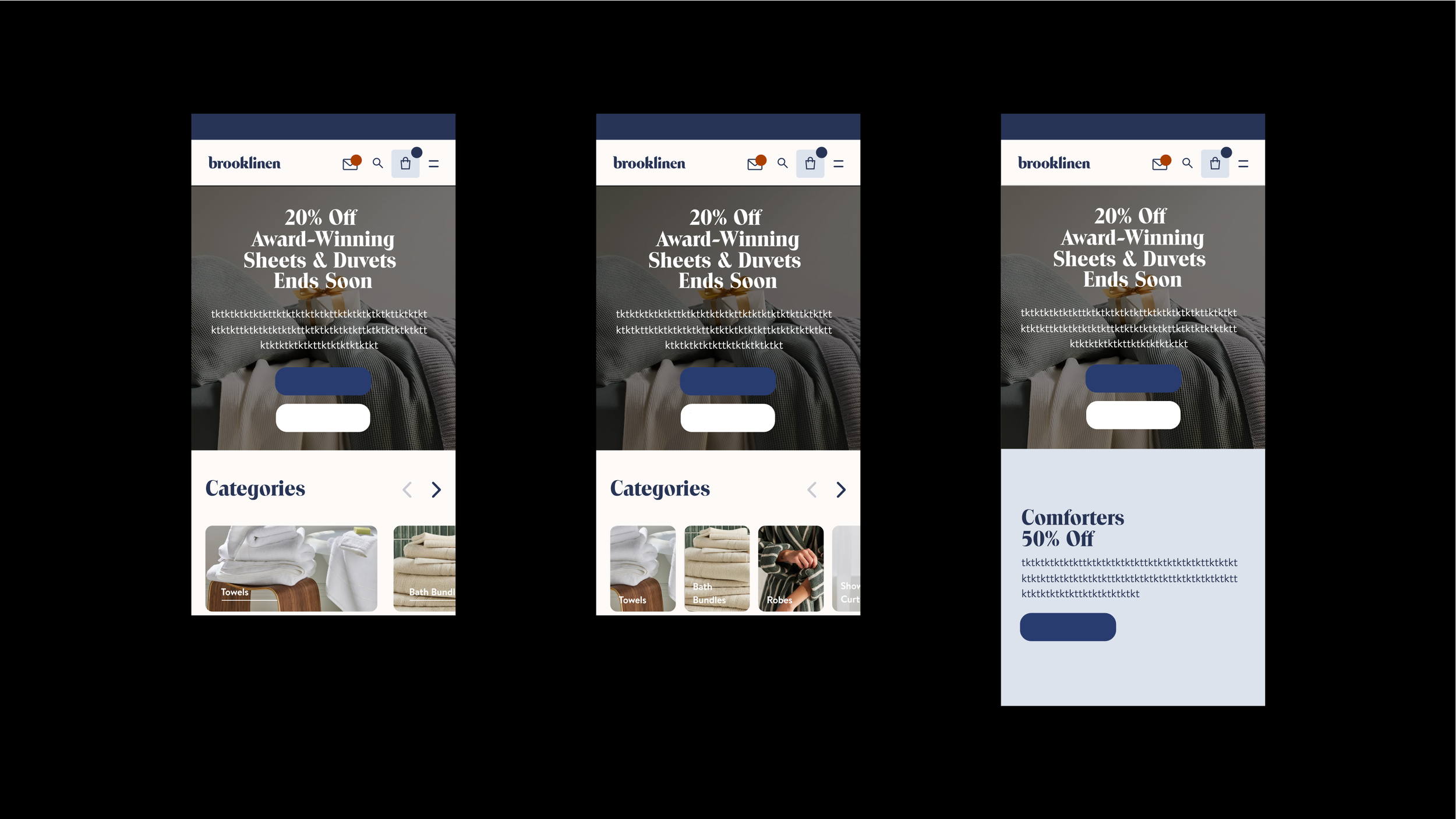
Mobile Exposed Navigation - First HP Category Touchpoint
Hypothesis: If we surface top-level categories in the exposed mobile navigation (above the fold), then users who have not interacted with the hamburger menu will be more likely to click through to product listing pages (PLPs), resulting in increased CTR.
Visual Category Module - Second HP Category Touchpoint
Hypothesis: If users scroll past the Mobile Exposed Navigation, then surfacing a more visually engaging module (visual category module) below the fold, featuring a mix of high-level and granular categories, will increase user engagement and drive higher click-through rates (CTR) to product listing pages (PLPs).

Solution & Impact
We A/B testing this feature against a version of the site without the mobile exposed navigation. While bounce rate only improved slightly, our conversion went up beyond our expectations, allowing us to proceed with the design.
0.03% ↓
Decrease In Bounce Rate
6% ↑
Increase In Conversion
4% ↑
Increase In CTR To Page After Homepage
